.
Lee Frost is a photographer based in Northumberland. He leads photographic tours and workshops, and write books and articles – and one thing I especially like about his articles is that they provide information that is useful, basic and accessible – his writings really have really helped me get on with photography in what I consider a better way. The 8 Oct 2011 edition of Amateur Photographer (AP) magazine – which, as always, I wholeheartedly recommend to you – came with a free supplement – Advanced Guide to Black & White – in which Lee wrote this:
.
“However, if there’s one fault I see time and again in black & white images it’s a lack of ‘oomph’, for want of a better word – images that lack contrast and impact. I’m not totally sure why this is the case, but I do think a lot of photographers are afraid of the genre. Avoiding blocked shadows and blown highlights has been drilled into us so often that it’s left us afraid to let shadows go black or highlights turn white. In a colour image that’s probably not a bad thing, but in a monochrome image, black and white are crucial ingredients, otherwise all you are left to work with are grey tones – and that is hardly exciting … What you need to do is forget about realism … Throw caution to the wind, let your creative hair down and be brave. You won’t regret it, and your images will be better for it.”.
.
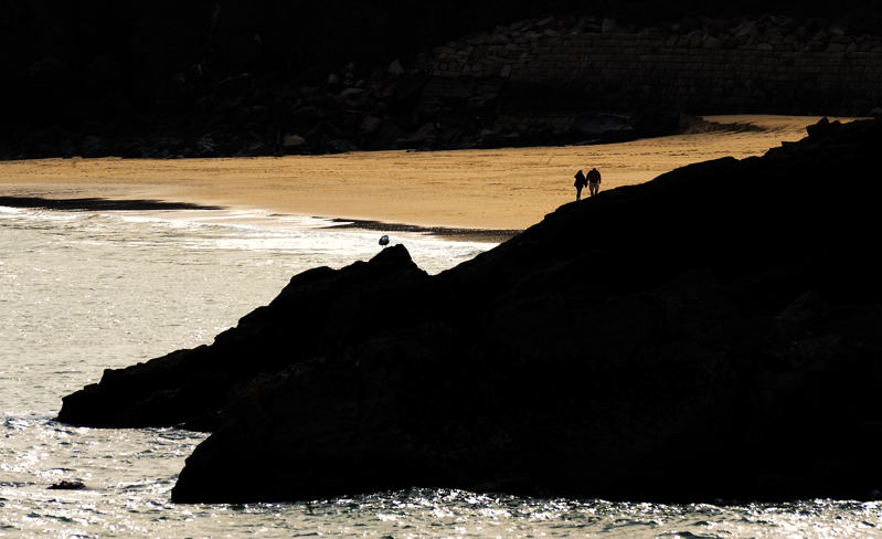
I agree completely with Lee. Many of the black and white images that I see lack oomph ( = excitement, energy), they can be rather insipid, and in many cases I think they have been produced by photographers who take great care at the point of capture to avoid pure blacks and whites by ensuring that their shots’ histograms don’t touch either end of the chart >>> and then go on to do exactly the same thing when converting their colour images to mono. Now images that consist entirely of grey tones have their place, I’m not saying that they don’t, but to restrict oneself entirely to this look foregoes that whole other, very striking world where pure blacks and whites make their presence very sharply felt.
.
I’m talking here of two distinct points in the digital photographic process – capture and post-capture. Let’s consider each of these in turn.
.
PURE BLACKS AND WHITES AT CAPTURE
.
At the point of capture, i.e. when the photo is actually being taken, you should give great attention to your histogram if you are intent in retaining all of the image’s detail – because if you let the histogram touch either end of the chart, you will lose detail in those parts of the image that are pure black or pure white. This picture detail is lost completely, you won’t be able to retrieve it.
.
However, if you’re at one with losing image detail in this way – and restricting your processing options with the image post-capture too – then there is no problem in allowing pure blacks and white at the moment of capture. And here is someone who does just this. Damien Lovegrove is a professional portrait and wedding photographer with great expertise, and in the AP of 5 July 2014 he says:
.
“… there can be any number of acceptable exposures, from silhouette to super bright, no lightmeter can make the decision about exposure for me. This part is art, not science. As I often have large areas of pure white or black in my images, I avoid consulting the histogram.”.
.
PURE BLACKS AND WHITES POST-CAPTURE
.
This is the safer route, and I think that this is more what Lee Frost is talking about. For there is, as mentioned above, the temptation to solely produce black and white images that, in fact don’t have any black or white in them, but which are solely shades of grey. But here – after you’ve captured the image and can make endless copies of it – here is where you can endlessly experiment with striking black and white (and colour!) compositions ->>> pictures with oomph!
And I urge you >>>
-
ALWAYS to experiment and to stay open to possibilities;
-
NEVER refrain from exploring some visual possibility that you think might hold promise for an image just because someone else thinks its not the thing to do!
-
ALWAYS follow your instincts, your gut feelings! OK, there will be failures and lessons along the way – oh boy, have I had failures and lessons along the way! >>> and I still do today – but when we follow our instincts we are learning, becoming more experienced, moving forwards – and these are the really worthwhile things.


Great writing Adrian, and oh so true. I recognise your photography in what you write.
LikeLike
Philip, that’s very good to hear – thank you! And its good to see you back blogging too! Adrian
LikeLike
Here! Here! Absolutely right, Adrian. Well written. That’s what I love about B&W and I’ve loved the ‘soot and whitewash’ style, as it has been termed, since the late 1970s. You can manipulate B&W images in ways you can never manipulate colour. Contrast is a wonderful tool. The huge advantage of the digital era is that we don’t have to shoot in B&W – we can choose back home which images to convert and during the processing adjust the tones of the greys using the filters available in the convert to B&W option.
LikeLike
I love “soot and whitewash”, Andy >>> and you’ve hit the nail right on the head with what you’ve said here – thanks for your thoughts, man! I’ve got naughty inklings about manipulating colour too tho, but where that’ll go I don’t know – but buy a pair of sunglasses just in case! Oh yes >>> and do let me know if you get any further with identifying that bird of prey. Adrian
LikeLike
The thinking is that the ‘Bird’ is a female Sparrowhawk. My sunglasses are ready polished…!
LikeLiked by 1 person
Thanks for this, it will maybe give me the courage to experiment! very useful perspective (excuse the pun).
LikeLike
Please do experiment, I can’t urge this too strongly. And there are two stages here, aren’t there?
The first requires no courage at all. Simply make a copy of a photo that you like or think may have further potential, and play around with it with your image processing software. Do unthinkable things, “What if I change that? What if I change this? What if I severely crop it?”. And if in the (bitter?) end you are looking at a total mess, then delete it, make another copy, and try again. Digital photography makes such experimentation ridiculously easy.
The second stage does require courage – putting an experiment out onto your blog, out onto the Net. But what is the worst that can happen? People can only say its dreadful, its not the end of the world – and you can try again. Experiments often come out on my blog – and even if they’re liked, I quite often look back on them as the months roll by and think OMG! One thing to do is to say in your post that the image is an experiment – and particularly request opinions and feedback. Adrian
LikeLike
A well stated piece Adrian and great links!
LikeLike
Thank you very much, Patti, I’m glad its useful! Adrian
LikeLike
You’ve expressed this to me – about contrast when required. I am looking more closely. Observing more intensely. It doesn’t come natural. I have to work at it, but…practice practice practice. These photos rock. ❤️
LikeLike
Yes, practice practice practice is the thing – and experiment with your photo processing software – what do you use? I might be able to give you tips. Glad you like the pix! ATP xxx
LikeLiked by 1 person
LOL Photo processing software!? What’s that? I only use apps on my phone. I am so not knowledgeable of such things! (I wish). But thanks. You can just tell me what you like and what to work on and I’ll do my best. 😉
xxx ❤️
LikeLike
OK, its a deal, bud – I sense a challenge! OMG ….. 😉
LikeLike
Ahhhhhh!
LikeLike
Hi Adrian an excellent post with which I fully agree. Colour photographers coming to B&W are generally far to timid in their approach to a different medium. Thanks Andy
LikeLike
Yes, I think you’ve hit it – colour photographers coming to mono – and of course, with the advent of digital, mono has never been so accessible, so more and more colour photographers are branching out into it. Thanks for your thoughts, Andy! Adrian
LikeLike
Many thanks Adrian ! A brilliant blog post and I remember these pictures of yours …
It’s liberating to experiment – just needs a bit of confidence I feel to go with what it all at times 🙂
Much appreciate your link to Lee Frost – have had a look at his work … wow .. He’s been generous enough to share downloads too of a great many of his past magazine articles .
LikeLike
Poppy, I’m really glad that you’ve found this post helpful – good! And I hadn’t realised that Lee has some of his articles online – I don’t know about the other mag, but try some of the Black and White Photography ones, I used to subscribe to that mag too and always liked Lee’s stuff. Good to hear from you! Adrian
LikeLiked by 1 person
Good advice, Adrian. With painting it is the same thing.. we are afraid of the shadows, but never achieve either realism or depth without them.
Mind, you could say the same about life too.
LikeLike
That’s interesting to know, Sue, thank you! That’s the thing, isn’t it, shadows matter >>> and I may have rant on about HDR photography at some stage, because HDR makes any shadows that are there paler!!! Aaaaaaarrrgggh!!!!!!!!!!!!!!!!!!!!!!!!!!!!!!!!
Yes, and in life too – if there are no shadows, we are not really living; all reality has some shadows. Thanks, Sue. Adrian 🙂
LikeLike
Never use HDR myself… in fact, I completely underuse the cameras capabilities most of the time.
LikeLike
Well you haven’t missed anything! And I bet that most people don’t use all these digital bells and whistles – I certainly don’t! A
LikeLike
You’d miss most of the shots faffing with the dials.. or I would anyway 🙂
LikeLike
Oh, I can feel an adage coming on … “Faffing is the thief of time” …………. wonder if I’ll be forgotten for that? ……
LikeLike
I would remember you for that… but with the goldfish memory there’s no guarantees how long 😉
LikeLiked by 1 person