USE YOUR PC’s F11 KEY TO VIEW THIS PAGE FULLSCREEN
.

.
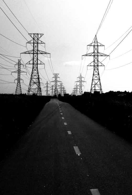
I’ve recently written some posts on simple ways to improve photographs. These posts are aimed at those relatively new to photography, and the ones published so far can be found via these links – ONE, TWO, THREE. Someone contacted me about improving their pictures, and I suggested that she send me a photo, saying what she thought about it and what she had been trying to achieve. That photo is above here and an idea of mine is some way below here. OK then, things to think about.
.
THIS MAY BE EXACTLY WHAT WAS INTENDED
.
Reiterating what may be becoming my mantra, I want to start by saying that we are all different. You and I may share some visual tastes but we equally well we may not. Keeping that essential concept firmly in mind, there is the possibility that this image is exactly what was intended, and that it is exactly what the photographer likes – and in this case there is nothing more to be said.
.
Because the photographer’s tastes matter, YOUR tastes matter and, to my mind, telling someone that their visual tastes are somehow “wrong” is on a par with telling them they believe in the “wrong” religion, or that your religion is “better” than theirs’ – its an unthinkable thing to do!
.
So here is a sunny landscape with a road and power lines taking our eyes deeply into the composition, and leading us to a retreating mass of pylons, which escort our gaze to the horizon. And there are tower blocks, and lots of beautiful green grass. Aside from liking this image, maybe the photographer wanted a record of how the place looked, and this shot does that exactly.
.
BUT HERE IS WHAT THE PHOTOGRAPHER THINKS
.
But, from our correspondence, it appears that this is not what the photographer wished to convey. Or, rather, it is – but a common and fatal mistake has been made. The photographer has seen something visually attractive – the pylons (and maybe the road too), and photographed it – forgetting that there are many other visual items in the frame besides those which caught her eye. Oh I’ve been there, I’ve done that! >>> and I bet that you have too!
.
So, two ways forward, of which the better is to use your screen or viewfinder to exclude unwanted items from the image when you capture it, so as to fill the frame with your subject – i.e. what you perceive as visually attractive.
.
Remember – what YOU see as visually attractive could be anything – this whole landscape, or the road and pylons, or only a single pylon, or the tower block, etc., etc.
.
The second option, made easy by digital, is to crop the image on your PC, to exclude the unwanted bits – and here is an example cropped to somewhere near MY tastes.
.
SUBJECTIVITY RAISES ITS GLORIOUS HEAD ONCE MORE
.
I’m going to attempt this – but remember that this is ME, MY thoughts and preferences – YOU may not agree with them at all!
.
OK, if the subject here really is the power lines, are the other things in the shot required – the grass, the bushes, the tower blocks? Because if not, then they should be excluded from the frame or made less conspicuous – see the first of these articles.
.
Next, the road is an excellent lead in line, it takes our eyes to the pylons, and then they take our eyes on into the distance. But maybe it would have been better to have got closer to the pylons so that they occupy more of the frame. In her email, the photographer talks about the power lines, but I think the stark pylons more impressive, so I’m going to concentrate on them.
.
Here is an attempt. Its in mono, to simplify it, because we’re looking at those stark pylons, and the wonderful, lead-ins produced by the power lines, and by the road, with its central yellow lines. All colour distraction has disappeared – the grass and so on is black. This is no longer a record shot, an image that faithfully shows us what the place looks like – this is now getting towards more of an impression that I have in my mind.
.
If I were going to re-take this photo, I’d get closer to the pylons (remember the photographer Robert Capa’s advice – “if your photos aren’t good enough, you weren’t close enough”), and use the telephoto end of my camera’s zoom to pack them in, closer together.
.
Any thoughts, anyone??? (For a start, I think I should have darkened the sky!)
.
.
.
.
GENERAL THOUGHTS

.
If you’re intent on improving your photography, then its worth getting some sort of computer that has a reasonably large screen, since trying to edit on small screens is more difficult. And if you’re really up for it, get a computer with a powerful graphics card, and plenty of oomph! Oomph? What do I know about IT???
.
And get some kind of image editing software – something like Adobe Lightroom or Photoshop Elements, but there are many others – because such programmes really do enhance your creativity. Many cameras contain image editing functions, but I’d always always ALWAYS!!! rather download my shots to a computer, and work on them there.
.
I sometimes read of people considering image editing software expensive, and begrudging spending any money on it. Well I certainly do NOT agree with such sentiments – such programmes can do so much for your photography that not investing in one (or more) of them is a very, very false economy. And I think I’m right in saying that one or two of these programmes can be obtained for free.
.
What do I use? My base programme is Nikon’s Capture NX2, and then programmes in The Nik Collection, a collection of software originally created by Nik Software, and now owned by Google. The Nik programme I use most is Silver Efex Pro 2, a must for any black and white enthusiast; and also Color Efex Pro 4 – ditto for the colour world.
.
And always shoot RAW files, as they have more creative potential, i.e. you can process them more radically and thoroughly than is possible with jpegs.
.
.
.

A great post with excellent advice throughout, and which led to a much better image, Adrian. Darker Sky? Maybe. There is some detail in the clouds, that could be enhanced. Certainly worth a look, however, the contrast between the power lines /pylons and the sky does work well, and is I think, necessary. Not too dark then? Dave
LikeLike
Yes, good point – if the sky darkens too much, the power lines will disappear – good thinking! Thanks for your good thoughts, Dave. A
LikeLike
completely agree! Wonderfully presented edited image.
LikeLike
Thanks, Sonali! I know you and I are at one on many of these things. Adrian 🙂
LikeLike
Yes !! Am happy about it !
LikeLike
So am I!!!
LikeLike
The second image is way, way more interesting than the first – a perfect illustration of your point about what the subject is.
LikeLike
Thank you – glad it hits home! And thank you again, Lynn, for leaving all of these Comments – I love to hear from people! Adrian
LikeLike
Very much like the cropped image, Adrian. Mono further reduces it down to just light & form. V strong interpretation. Re. monitors…I recommend a good IPS type for colour accuracy. I also chose a 16:10 (rather than 16:9) because I tend to have a lot of portrait format! (FWIW mine is a Dell U2412M – probably small by todays standards.) Cheers, Owen
LikeLike
Thanks, Owen, for the good things you say about the mono image. Mono is really something else, so useful and so powerful. Still think the sky should be a little darker.
And thanks for the thoughts on monitors – that’s useful detail! Adrian
LikeLike
An excellent piece, thank you Adrian!
LikeLike
Glad its useful, Patti, thank you! Adrian 🙂
LikeLike
Well said and well executed.
LikeLike
Thank you! Adrian
LikeLike